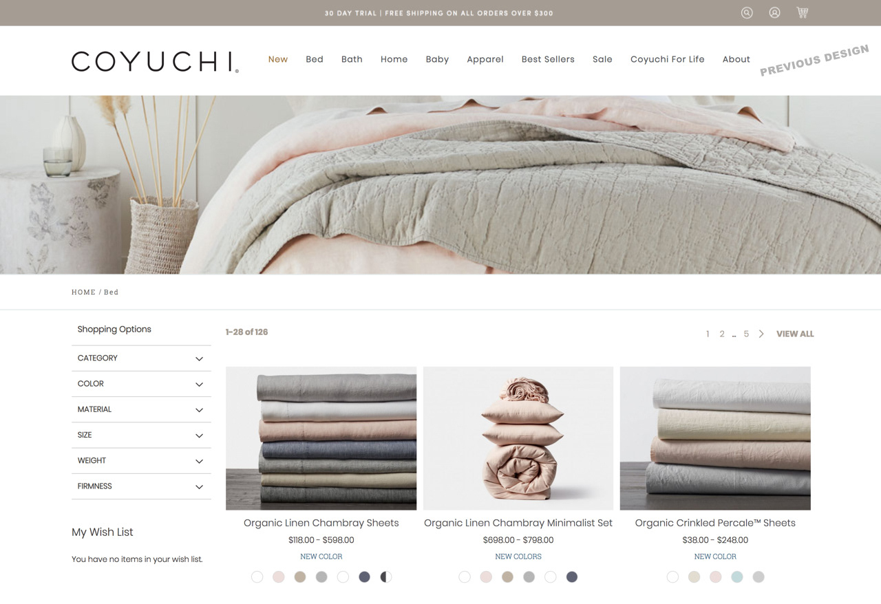
Listing page objectives:
Improve the discoverability and visibility of both the filter menu and product images.
Updates:
The previous filter menu was often overlooked, and cluttered, and made the product rows narrower on desktop. We made the filter menu more prominent by moving it above the product rows. This also gave more vertical real estate to the product rows. The product descriptions and color swatches also gained more real estate.

Objectives for the navigation and adding an item to cart:
Clean up the design, and make it more accessible, and consistent.
Mini cart updates:
We made adding items to the cart more visible to the customer by adding a mini cart popup. Previously, there was a temporary green Magento base notification banner that would appear when the customer added something to their cart. From the data we gathered, the customer sometimes missed this notification and it was also not consistent with the rest of the design of the site.
Navigation updates:
I added an underline marker to the navigation to make it more clear to the customer what page they are on.
The previous icons were outlines and were harder to see.